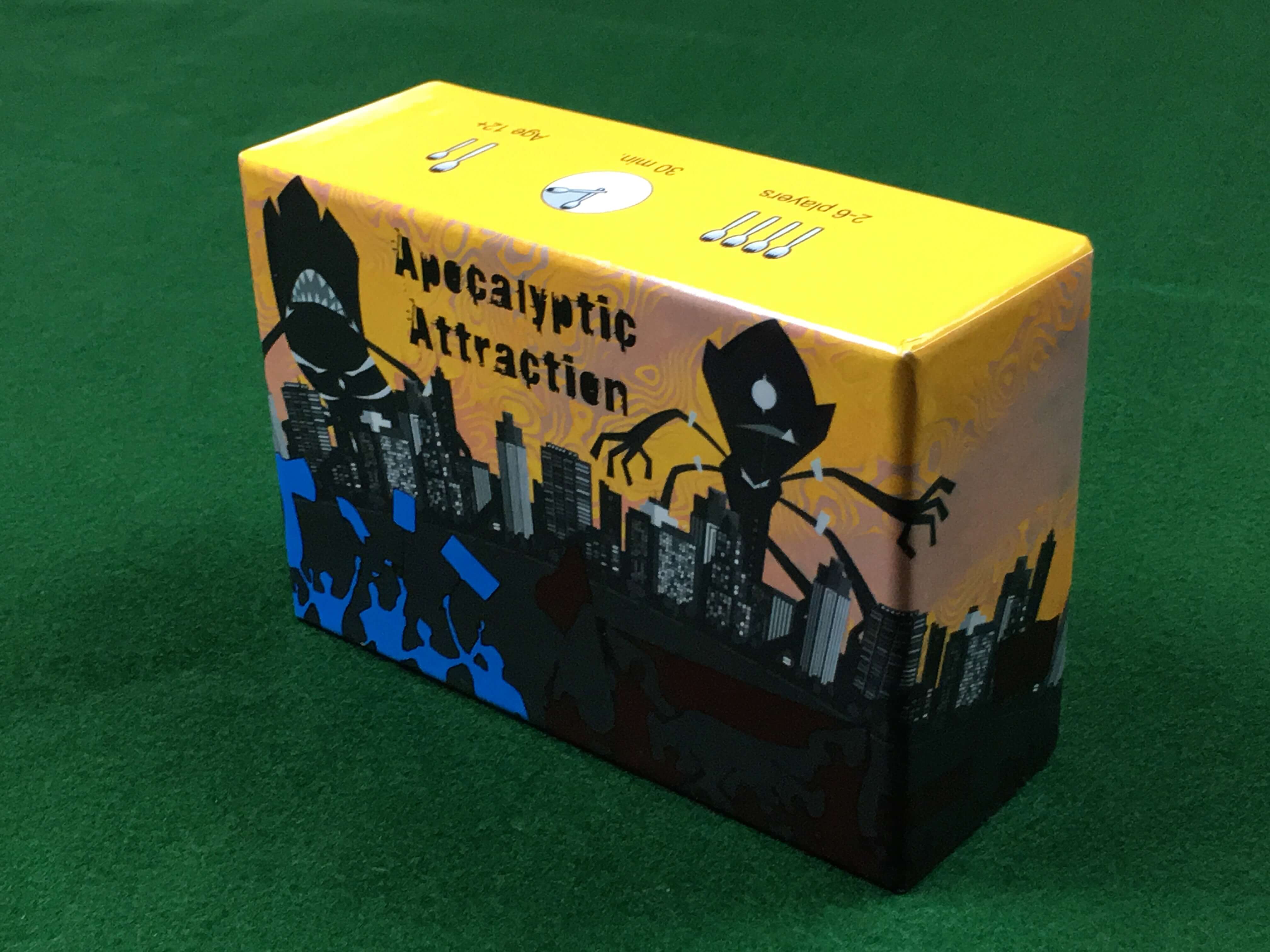
Apocalyptic Attraction is a dexterity and bluffing game by Chris Romansky of Sporktopia that puts players in a dystopian future where an inter-dimensional monster invasion has become so overwhelming that the citizens have nothing left to do but cheer on their favorite monster.
Each player is secretly assigned one of 6 available monsters to root for. Each monster has a different set of preferences for the emotions the citizens around them give off. Some emotions help them while others harm them.
Players all lay cards into a shared city board made up of buildings that give off the different emotions when citizens (i.e. meeples) occupy them. Both during and after the construction of the city, players toss their meeples at the city with the aim of filling the buildings that will most benefit their preferred monster. Players also get points for correctly guessing which monster others are rooting for.
This is one in a series of seven articles outlining my judging decisions for the finalists in The Game Crafter‘s social deduction game design challenge. You can see the full article list here.
Visit Gamified Content’s YouTube channel to watch my review of Apocalyptic Attraction’s shop page from the semi-finalist judging round.
High-Level Review
This game does a good job of giving players fun and engaging things to do on their turn. The bright colors give it a nice table presence and the theme is unique and amusing.
The components players used for recording their guesses for others’ identities could be simplified to save expense and streamline play.
Tossing the meeples was fun to do and watch, but it created a random element that took away from the player banter, misdirection, and lie detection I believe is at the core of what makes a social deduction game experience memorable and funny.
Components
The game comes in a small stout box with a zany illustration on the cover.
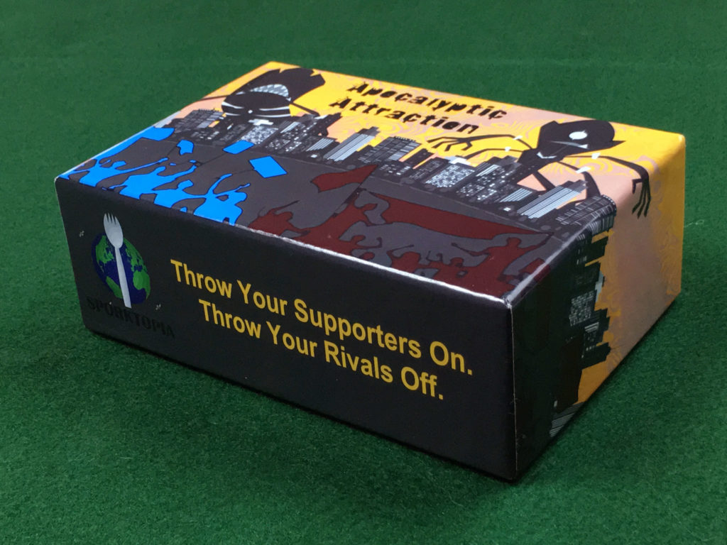
After playing the game, I realize that the “Throw Your Rivals Off” part of the tagline on the side is a clever pun. However, before reading the rules and playing, I thought it meant we would literally be removing our opponent’s meeples from the board.
This tagline would have made more sense to me the first time I saw it if it appeared as a sidebar in the rule book sometime after I had fully learned how to play the game instead of the outside of the box. Without knowing how the game works, this statement could give people the impression the game is more confrontational than it actually is. For players that dislike direct confrontation in games, this could unnecessarily drive them away from the game when they might have enjoyed it if they tried it.
The text on the Sporktopia logo is a little difficult to read because it’s fairly similar to the background color on the side of the box. If this text was a lighter color, it would be easier to read.
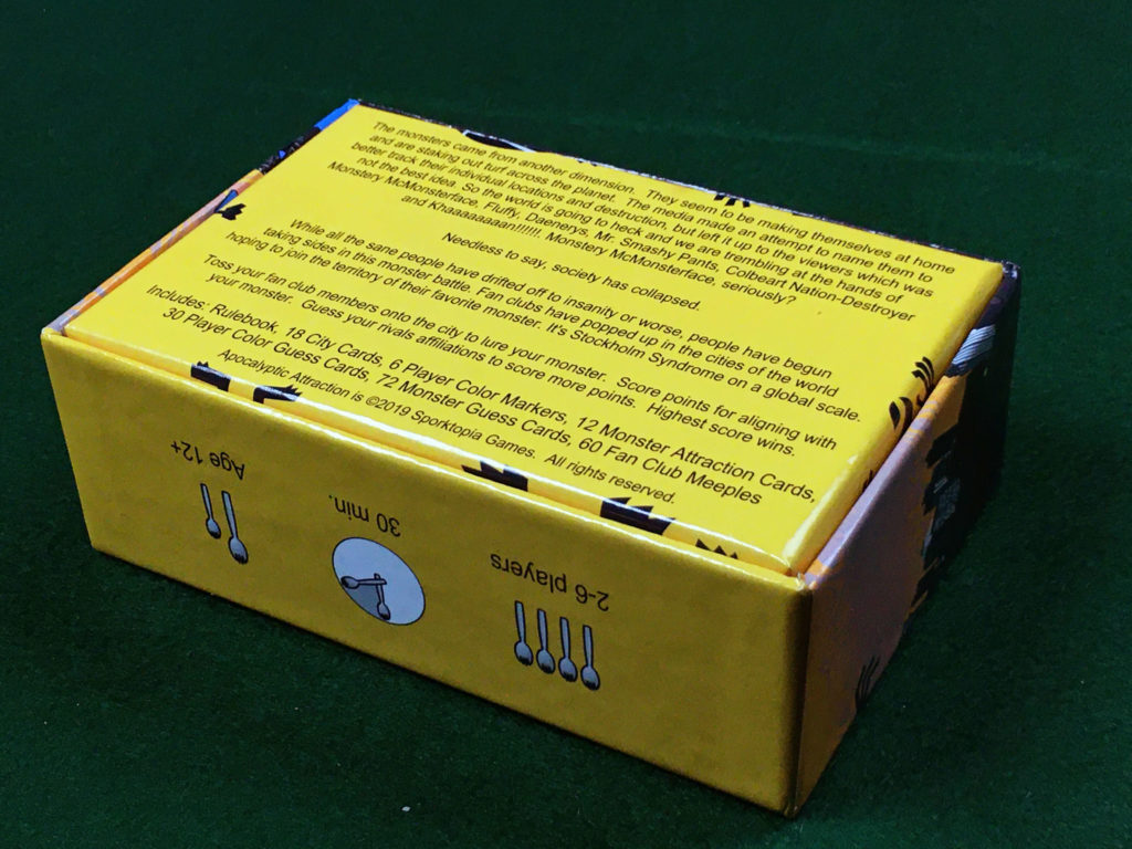
The back of the box tells the darkly comedic back story of the game and gives a quick overview of what to expect from the game play as well as a list of the components. A picture of the game setup might make the content on the back of the box more compelling and faster to process, but the written description serves its purpose fairly well.
The side of the box has a set of Sporktopia branded icons with corresponding game play stats. I love having easy access to this info on the outside of the box, and the spork branding is a nice touch.
The space inside the box is filled up with a bag of meeples and a few different sizes of cards. There is also an 8 page rule book that fits perfectly inside the box.
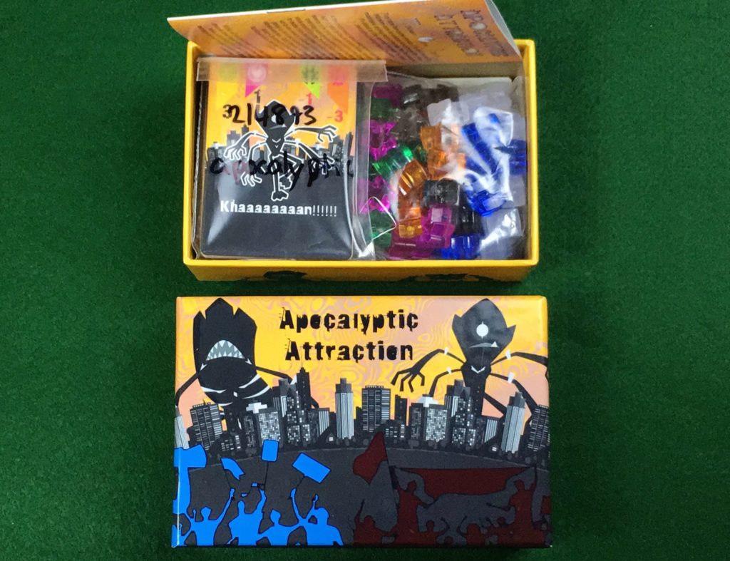
The game comes with enough components for 6 players with 6 different colors of player meeples and 6 different monsters to choose from.
The cards players use to build out the city are jumbo sized, the player color and monster assignment cards are poker sized, and the cards players use to lock in their guesses at the end are mini sized.
The back of the monster assignment cards serve a dual purpose of a player reference for the emotion preferences for each of the monsters. I thought this was a clever way of streamlining the components.
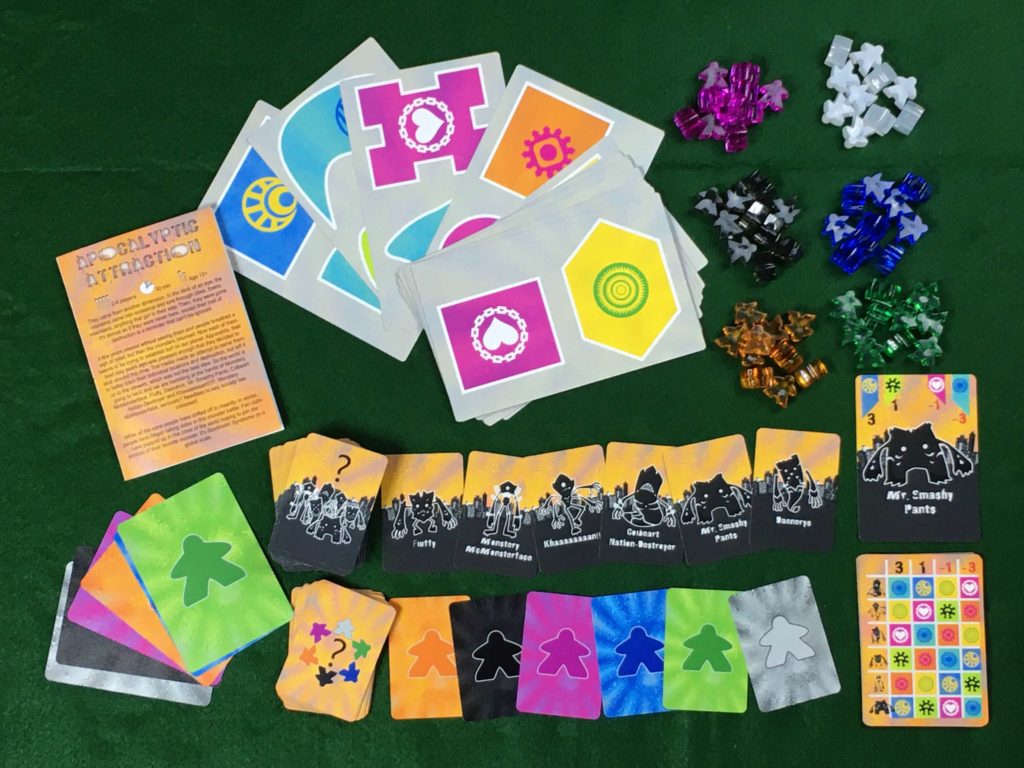
Each player gets 10 meeples in their color, a large card of their own color to help their opponents keep track of who owns which color of meeple out on the board, 2 starter city cards to place, and a set of cards to use at the end for guessing their opponents’ monster affiliation.
Some play testers said they had a hard time seeing the difference between some of the small monster icons on the player reference as well as trouble matching them up with the corresponding card with the monster’s title. Mr. Smashy Pants and Colbert Nation Destroyer each looked fairly unique, but Monstery McMonsterface and Khaaaaaaaan!!! look somewhat similar to one another at a small size, and Daenerys and Fluffy are also a bit difficult to tell apart.
The reference card might be easier to read if it had bold letters in place of the tiny monster symbols and all of the monster assignment cards had letters in the top corners to help match them up. If all of the monster’s names could start with a different letter of the alphabet, they could match with the monster by using their first initial. Perhaps Mr. Smashy Pants could become Sir Smashy Pants to make C, D, F, K, M, and S the set of unique letters?
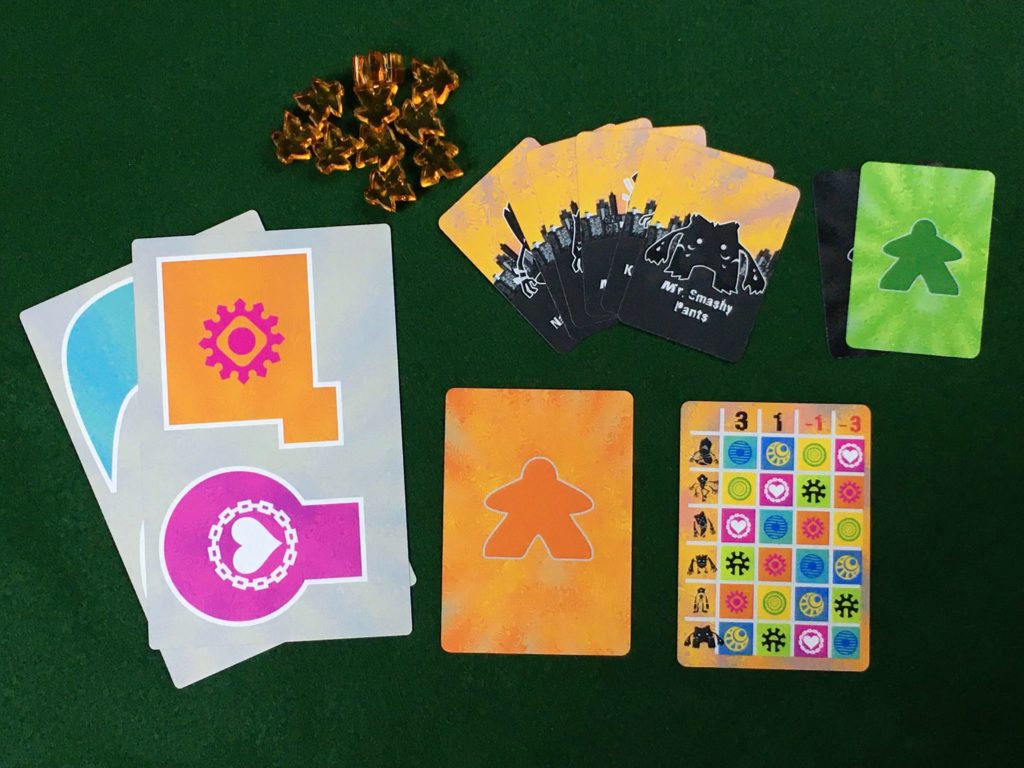
Players get 2 actions per turn and can choose to lay a city card or toss a meeple for each of their actions. They can lay city cards over the top of one another to try and limit the area available for certain emotions, but they are not allowed to move or overlap any meeples already in the city as they do this.
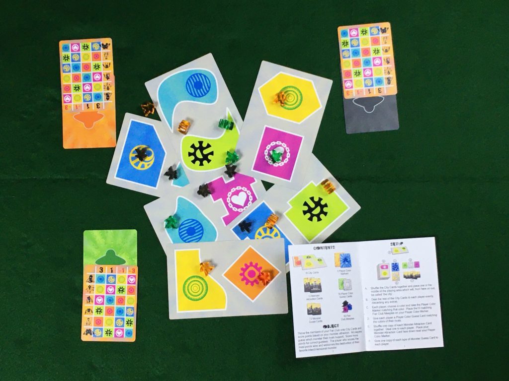
At the end of the game, each player locks in their guesses by placing one of their set of 6 small monster cards face down on top of the small player color card for each of their opponents’ colors.
Sorting out all of the mini cards for the guessing round was a bit tedious and time consuming.
Assuming TGC is the printer for the game, the following component changes could streamline the guessing phase while likely also saving on component costs:
- Remove the mini cards.
- Be sure UV coating is turned on for all the cards.
- Put a list of the monster names (including the reference letter if making the change to the player aid suggested above) on the back of the player color reference cards with a blank space under each monster name for the player color guess.
- Add a few dry erase markers players can use to write their guesses on the back of the color assignment card. Putting enough dry erase markers in the box for each player to have their own would be nice but potentially unnecessary, since each player would only use the marker for 1-2 minutes during the entire game.
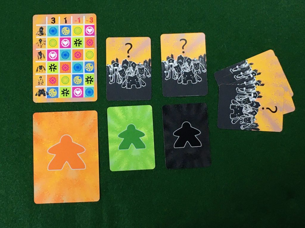
Overall, the components for this game were well organized and fairly intuitive to use. Nothing caused a major stall or confusion during our play through.
Game Play and Mechanics
In the early part of the game, each player has 2 double sided city cards they can choose to lay out on the table. Each side has a different set of emotions that may be either attractive or repulsive for the monster you are rooting for.
Since the cards are double sided, only the player placing the card has easy visibility to which emotions they are placing face down and excluding from the city. Since these are the only actions players can take that are not affected by the randomness of the dexterity element, it would be nice if it allowed for more chances to bluff and observe others’ decisions.
The process of laying out the city cards might be more interesting if the cards had small icons in one corner representing the emotions on the back side. This way, any observant player has the opportunity to keep tabs on which emotions another player might be actively trying to exclude. Although some of these icons would get covered up in the process of building the city, everyone would get a chance to see them at the time the card is added.
It could also be interesting to allow players to draft their city cards from an open card market rather than dealing them out randomly. This way, even their choice of card is a clue to the other players and an opportunity for a bluff.
Our group had several players that struggled with missing their targets and instead landing on the emotions that gave them the most negative points possible. Once this happens a few times during a player’s early turns, it can start to feel impossible to catch up.
It might help players feel there is at least a chance for them to catch up if the emotions that give positive points are larger numbers than the negative emotions. For example, the score breakdown could be +4, +2, -1, -3.
One play tester suggested including handicap scoring numbers that more skilled players could use when playing with newer players. While I don’t think this makes or breaks the game, I do think it could be a useful option to consider adding to the rule book.
As the scoring structure currently stands, players get points based on where their own meeples landed (ranging between -3 to +3 per meeple) and 5 points per correct guess against opponents.
Based on this, it could be a valid strategy for a player to purposefully aim off to the side of the city so as to be sure not to get any negative points or give any information about their goal away. Then, at the end, assuming the other players are playing straight, they could guess everyone else’s objectives and win the whole game without using any dexterity or bluffing skill.
One way of tightening up the rules to prevent this strategy would be to give players two separate scores — one for their tosses and one for their guesses — and make their final overall score the lower of the two.
Scoring
The following scoring breakdown is based on a rubric I released during the game design challenge on TGC’s contest page. All sections are worth a maximum of 1 point.
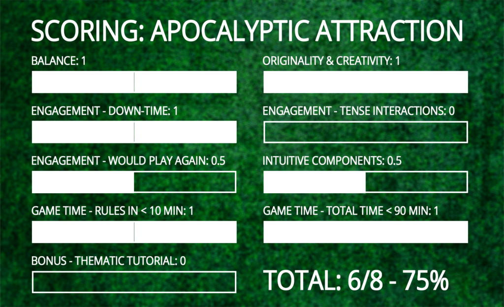
Balance: 1
Everyone felt they had an equal chance to win without sensing and unfair advantages or disadvantages for monster assignment or turn order.
Originality & Creativity: 1
This game is wonderfully weird. I’ve definitely never played anything like it before.
Engagement – Down-Time: 1
Our own turns went quickly and we needed to pay close attention on other players’ turns to try and get a sense for which emotion sectors they were aiming to hit. Even though the mini cards used for the guessing phase were a bit fiddly, we only used them once, and the guessing phase didn’t take much time either.
Engagement – Tense Interactions: 0
Since players didn’t need to discuss anything to carry out their turns, there was very little opportunity for accusations or misdirection. I could see how a particularly talkative player might loudly proclaim that they think their opponent is, for example, Mr. Smashy Pants when they really believe they are Fluffy, but our more reserved group of play testers didn’t do anything like this.
It seemed much more common for players to miss their targets than hit them when tossing their meeples, so watching players actions didn’t give much useful information about what their goals might be. The the final locations of the meeples could only be useful information (whether played straight or bluffed) if the player hit their intended target, and there was never a way to tell if they had or had not missed.
Engagement – Would Play Again: 0.5
Unlike several other finalists in this design challenge, this game ran smoothly without any major confusion or balance issues. Based on this, I would not absolutely refuse to play it again without adjustments, but I also wouldn’t seek it out. Though it was fairly enjoyable to try once, I feel like I have already experienced everything this version has to offer.
There are so many great games available on the market that a game needs to provide some kind of “it factor” to actually hit the table. The main thing that stands out in my memory of playing this game is simply throwing wildly bouncy meeples at cards and missing most of the time. I need something more puzzle-y or interactive to draw my interest.
I do think the theme and concept is funny and unique enough to give the game a chance to stand out, so I still think it’s worth developing further.
I would be interested to try a variant that either requires players to point to the spot they claim to be aiming for or allows players to flick meeples already in the city. I think either or both of these things could create enough opportunity to bluff and read others to make it feel more like a battle of wits.
Intuitive Components: 0.5
The player aid on the back of the monster assignment card was a clever use of space, and the symbols for the emotions were easy to tell apart even under a colorblind filter (I use the CVSimulator app to check this). The jumbo city cards and acrylic meeples also served their purposes fairly well.
However, the trouble players had matching the tiny monster icons to their names on the guessing cards paired with the inconvenience of sorting through the mini guessing cards makes me feel I can’t give full credit for this section.
Game Time – Rules in under 10 min: 1
The rules were straightforward and our group was able to get started playing quickly and easily.
Game Time – Total Time under 90 min: 1
We easily finished the whole process of learning and playing this game in under 90 minutes.
Bonus – Thematic Tutorial: 0
The game’s theme was fun and silly, but there was no tutorial mode that used theme or story to help walk players through the process of learning how to play.
Total Score: 6/8 – 75%
You can see the scoring breakdown for all the semi-finalists and finalists in this game design challenge in my public scoring spreadsheet.
Credits
Thank You to my Protospiel Madison Play Test Crew
Owen Lange, Will Newton, Dustin Oakley, and Seth Van Orden
Thanks for the thorough review and taking the time to play through. Definitely some things to think through moving forward (the differentiation of the monsters has been going on in the background during the judging). Fun contest!
You’re very welcome — I’m glad you had fun with it!
Thanks for participating and congrats on a solid entry.